
Create a mobile website
Create your responsive design website without any technical skills. Orson website builder is based on a grid system to help your make your mobile website in no time by adding and customising any text or image content.
Create a mobile website that fits tablets and smartphones
60% of searches are done today from a mobile. Users usually visit a website from a mobile and sometimes go on their computer at home or work to view further the website. We see a real change in the users usage on mobile in recent years.
This trend is growing with the growth of 4G and the technologies that make it possible to surf the Internet throughout our life:
- Free wi-fi in public gardens
- Public places
- Trains
- Planes
It is therefore imperative today to have a website called responsive design, that is to say that adapts to mobile phones and tablets at the graphic level of content text and images
Today, a website must be responsive design, which means that it contents text or image has adapts to any tablets or phones in terms The user experience must also fit on the mobile since screens are smaller.
The buttons, titles and texts must be adapted to the screen sizes so that the user does not have to zoom into his screen. The menu and the navigation must also adapt to the mobile with a "burger" menu that unrolls when clicked.
Mobile website or responsive design, vital for Google
Creating a responsive website is not only paramount to users but it is also essential for search engines like Google.
Indeed, Google's algorithm penalised websites that are not responsive design since when a user does a mobile search, websites that are not responsive design are no longer displayed anymore. It is a huge lack of business for companies. You will even see a label that identifies all mobile websites on the search results.
If you have an existing website, make sure your website is mobile. If this is not the case, ask your service provider to do it or else redo your website on Orson for example.
If you are creating your website now, responsive design is must have. Orson allows you to create a professional website responsive design without coding. It is integrated and free in the subscription.
You do not have to do anything special. Build your website normally without worrying about technical constraints, the website will automatically be adapted to mobile.

Mobile website or responsive website
We talk about mobile website and responsive website but what is the difference?
Creating a mobile website requires creating two websites, one desktop version and one mobile version. They have to different URL address like for Facebook: facebook.com and m.facebook.com.
This method was the first to emerge and there are still websites that use this technology today. The disadvantage of this methodology is to have to manage and maintain two websites over the long term. It's extremely time consuming and expensive.
Responsive design appeared
Right after the growth of mobile website, a new technology base on a grid system appears which made a revolution into the design and development world.
No need to create and maintain 2 websites anymore, just create and update a single responsive design website. Twitter have democratised this technology with the Twitter Bootstrap language. It is this technology that is used on mainly all responsive design websites. Orson websites are built on this language.
Templates 100% responsive design
Themes created on Orson.io by our web designers are all responsive design and ready to use and to be customised by an intuitive Drag and Drop system. You are free to change your images and texts, your website will always be responsive design not matter what. Orson websites looks also gorgeous and perfectly on all web browsers.
Loading time as important as responsive design
To ensure a pleasant usability on mobile, for example when you are in the subway or in a building, the second most important factor for Google’s algorithm is the loading time. The loading time of your website is the time needed for your website to be displayed totally from the moment you land on your website.
As an Internet user, we do not like to wait more than two seconds for a page to be displayed. So search engines like Google or Bing have taken this element into consideration for the ranking of websites and in Search Engine Optimization (SEO) criteria.
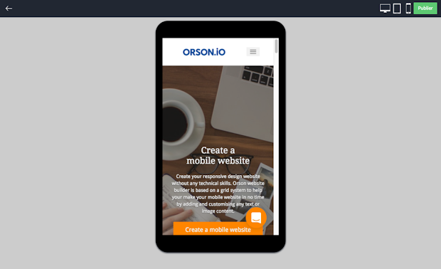
Preview your website directly on tablet and mobile
Orson website builder allows you to make a responsive design website directly in the online editor without having to check your website at each publication on different mobiles and tablets.
You can preview your work directly in the website building software at any time and you can select tablet or mobile mode and navigate inside your website. This is a real time saving in the process of creating your professional website.
A tool to help you locate yourself
To know if your website is suitable for mobile in general, Orson has developed a tool that lets you know if your website is responsive design directly from your computer without technical skills. Piresponsive is a 100% free and online tool . You just have to type your website URL address and run the mobile test tool.
We also created a tool, Orson Mobile Tester that gives a rating of 100 to check if your website is following Google's guidelines for mobile. It will check:
- User experience on mobile
- Load timing
- SEO of your mobile website
If you have a bad rate, you will have access to practical tips directly by email.
Orson website builder allows you to build a mobile website without coding with images that are compressed automatically and that are exported into CDN technology for faster loading. Orson’s website’s HTML5/CSS code is also compressed to serve pages faster.
How to create a mobile website on Orson.io?
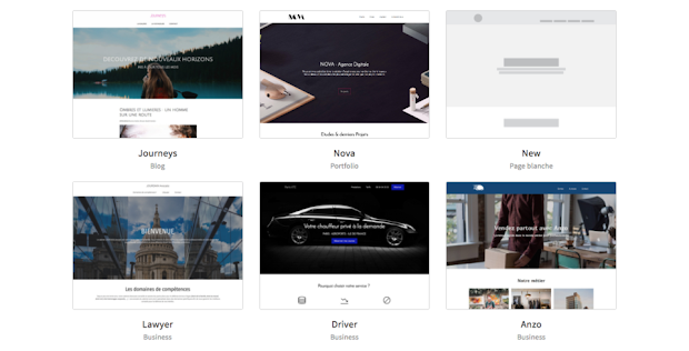
Start creating your responsive design website directly by starting your 15 days free trial with your email. You will be able to start from a template made by our designers.
Whether to create a portfolio, a blog, a professional website or an ecommerce, you will find a template which will suit you.
Each template is 100% mobile-friendly and have prebuilt layout and with default content which will give you inspiration to build your own website in no time.
Orson’s plan is without commitment and includes hosting, storage, bandwidth and professional domain name is offered. It’s an all-in-one solution to help you to have a real online presence.